Fourth Plain Forward is a Vancouver Washington organization focused on revitalizing the International District along Fourth Plain. They support the success of local businesses, promote the unique identity of the International District, and work to improve the physical environment of the district. They will accomplish this through connecting businesses with resources, maintaining and growing the international district brand, promoting the district through marketing, events and activities, and advocating for safety and transportation improvements
SLTFNDRY provided branding and consultation services.
Back Story
Fourth Plain Forward is a multi-year initiative to improve the portion of East Fourth Plain Boulevard known as Vancouver’s ‘international business district’—roughly between I-5 and 65th Ave in central Vancouver. The initiative is focused on strengthening and growing small businesses, creating opportunities for entrepreneurs, improving the corridor’s safety and appearance, and promoting equitable and inclusive development. Working jointly with partner organizations, the City of Vancouver aims to foster a vibrant and prosperous Fourth Plain corridor for residents, workers, and visitors. (City of Vancouver)
Goals
Our mission for this project was to create a brand that would reflect the goals of FPF, giving them an identity that would promote local growth. To reach these goals, we wanted to make sure that all imagery would be bright, locally focused, and business related.
Process
While working towards our goals, we researched what other neighborhood organizations have done in the past, and spoke with the FPF board of directors in order to more fully understand where they are coming from. During the design phase, we put together a wide range of logo proofs, all approaching the goal from a slightly different angle. After presenting our work to the board, we dove into an informative and constructive conversation about how they see their brand being used moving forward. Based on this, we were able to craft the brand that is there image today.

Challenges
Putting together a brand identity is all about finding the proper balance between a simple & easy to recognize logo, and a design that perfectly illustrates the values of a business. This project was no different. When we started getting some designs down onto paper (ok, screen), we found that there were so many elements that we wanted to include that the designs became a little too heavy. Our main trouble was distilling all our ideas down into one simple and cohesive image.
Key Features
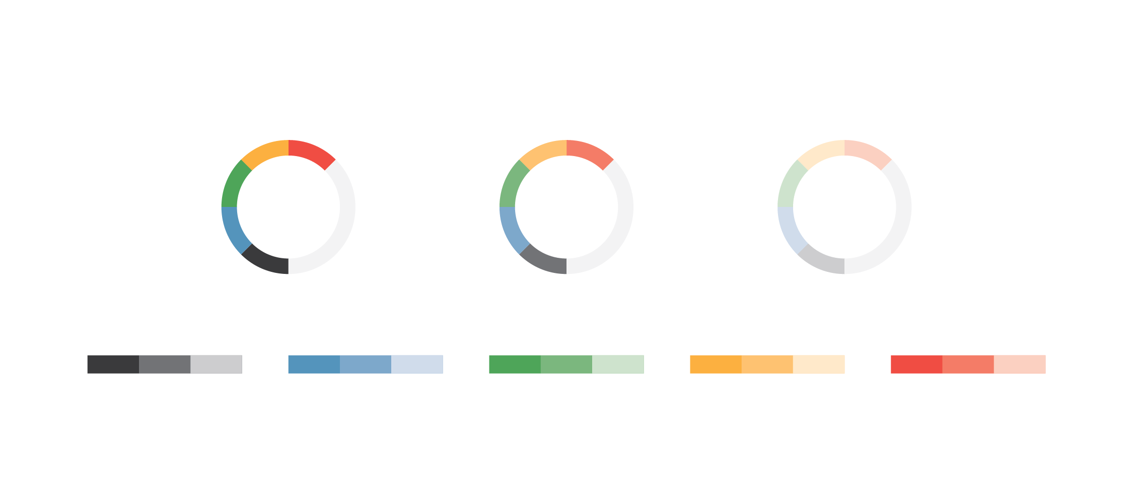
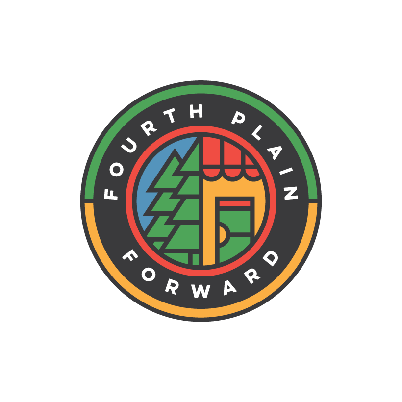
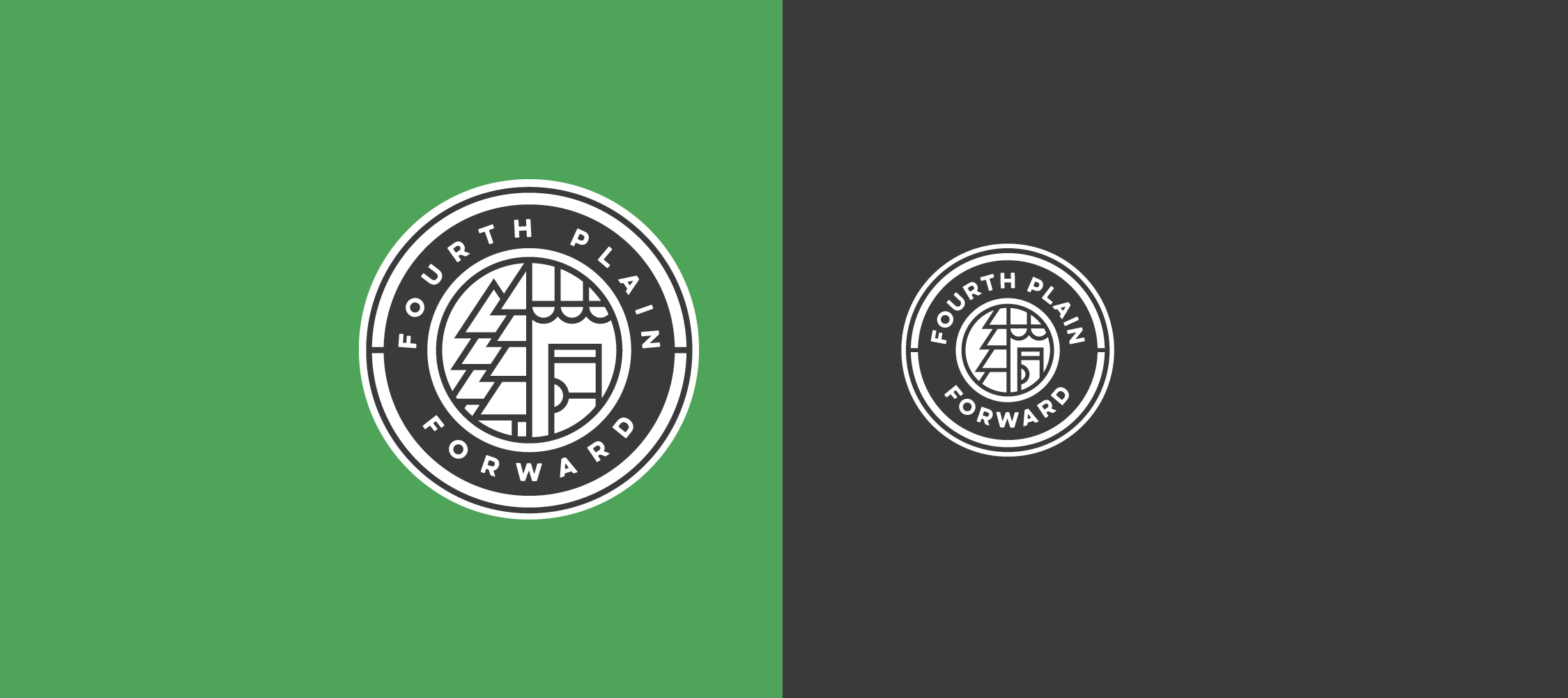
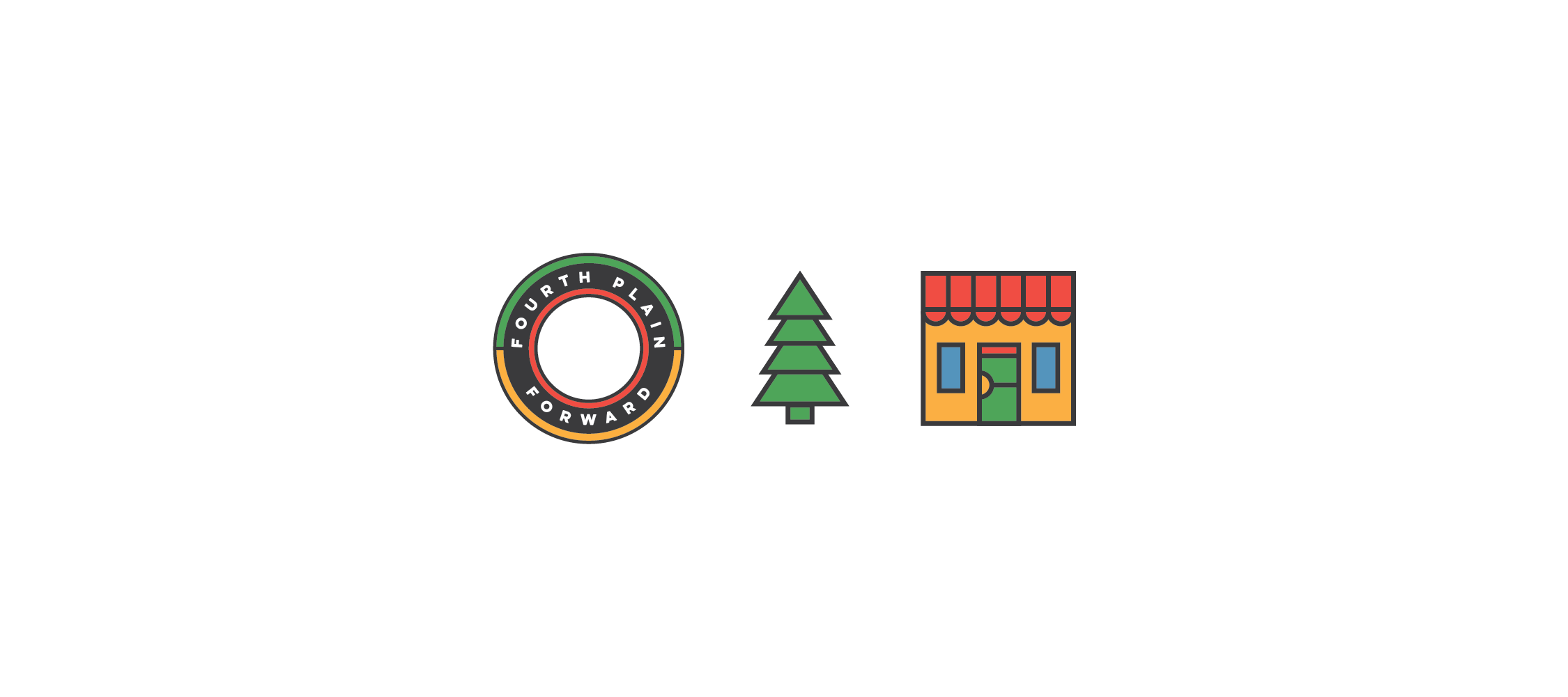
While created the logo for FPF, we decided to focus on just a few things. First, we wanted the logo to clearly represent business. Secondly, we wanted to make sure the logo would speak the local nature of the project. We brought the business idea into the picture by giving the logo a coin appearance, and then adding the storefront into the center. The local influence made an appearance with the PNW trees, and the small shop in the center. Lastly, since this is a brand focused around a specific section of roadway, the colors were inspired by traffic signals. These colors also represent growth (green), and financial security (gold).
Results
With this project, we were very excited with the final product and can’t wait to see what the organization does in the future. We’re pleased to have worked with FPF and created a brand that they’re excited to use.